
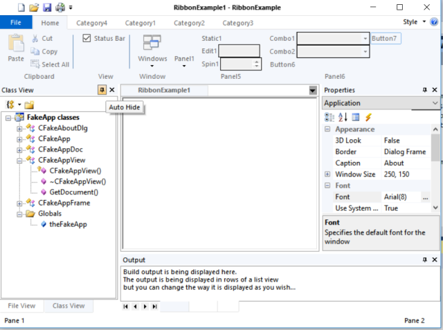
In this 4th installment of giving MFC a Windows 10 makeover, I want to focus on some of the little things that make an application look like its Windows 10, some of the items are going to seem picky but its more about attention to detail.
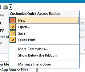
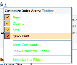
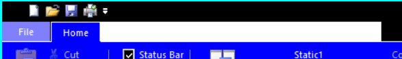
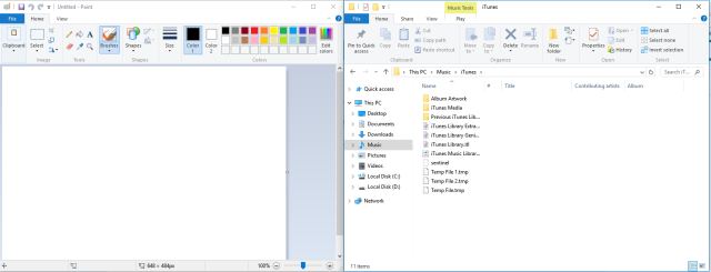
Quick Access Icons
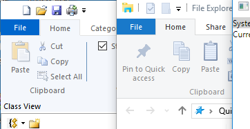
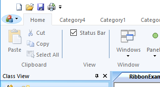
The first difference is the QuickAccess menu icons
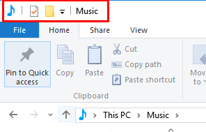
Of course the wizard generated app gives you icons from the 90’s
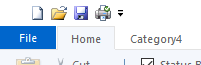
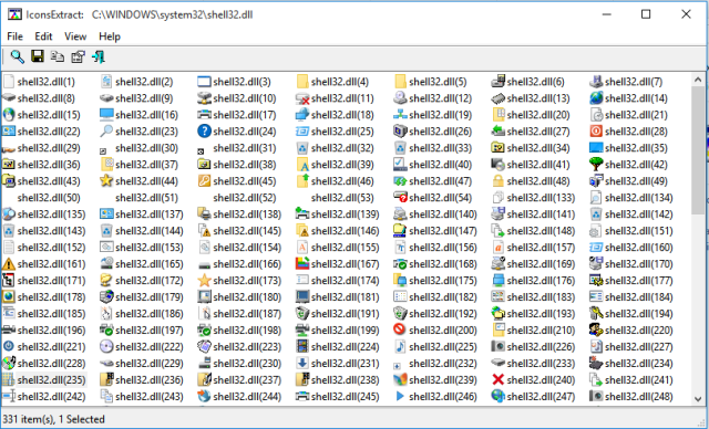
Make sure your app has Windows 10 looking icons, these icons are part of your applications resources (filesmall.bmp) in the wizard generate example project, so you’ll want to edit those. For Windows 10 these icons tend to come from the shell32.dll, use a tool like IconsExtract to get the Windows 10 looking icons you need. (if course you need to be aware of copyright issues when grabbing icons)
The icons should have a transparent background, I find this easier if I convert them to png using Paint.NET then make them transparent (wand tool + Ctrl-X), you can just as easily add a PNG resource to your project as a windows BMP
Colors
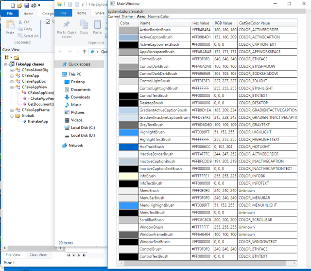
While we are on the topic of colors, there is one little issue that I have noticed that is annoying me.
That is the fact that the colors Windows 10 uses for the ribbon is infact NOT a standard sys color type. The actual color (on my system) is #F5F6F7 which as you can see from the swatch is not on the list of colors enumerated by GetSysColor(),
I also noticed that the File button (ApplicationButton) menu color is not quite the blue of HotTrackBrush either but itstead it is #1979CA, while this is very minor you can see the difference
It becomes very clear when you look at the 2 ribbons up close
So in our CWindows10Style class we’ll define 2 new colorref variables
COLORREF    m_clrWindows10Bar;
COLORREF    m_clrWindows10ApplicationButton;
And initialize them in the OnUpdateSystemColors call
// Windows 10 ribbon color
m_clrWindows10Bar = RGB(0xF5, 0xF6, 0xF7);

// Windows 10 file menu application button color
m_clrWindows10ApplicationButton = RGB(0x19,0x79,0xCA);
Where we had been drawing the ribbon background with
CBrush brush(GetSysColor(COLOR_INACTIVEBORDER));
pDC->FillRect(rectCategory, &brush);
We’ll now change this code to be
pDC->FillSolidRect(rectCategory, m_clrWindows10Bar);This will help reduce all the brushes being created, we can handle the Bar color needing to be something else (say due to high contrast) in the OnUpdateSystemColors()
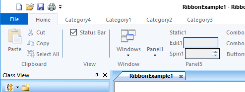
This subtle change has the effect of making the ribbons more similar.
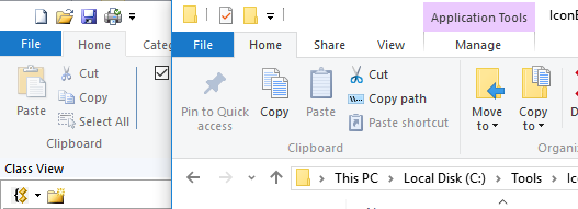
Ribbon Pane Separators
The more observant among you will notice that Windows 10 puts in a separator between each Category Panel, I’d simulated this in the ribbon resource by adding a separator, but this is far from idea as the separator height does not go down into the Category Panel label area

By making the following modifications to the earlier code, this will be drawn
// this is the caption at the bottom on each panel
    virtual void OnDrawRibbonPanelCaption(
        CDC* pDC,
        CMFCRibbonPanel* pPanel,
        CRect rectCaption)
    {
        pDC->FillSolidRect(rectCaption, m_clrWindows10Bar);

        CString str = pPanel->GetName();

        if (!str.IsEmpty())
        {
            rectCaption.DeflateRect(1, 1);

            if ((rectCaption.Width() % 2) == 0)
            {
                rectCaption.right--;
            }

            rectCaption.OffsetRect(0, -1);

            COLORREF clrTextOld = pDC->SetTextColor(GetSysColor(COLOR_GRAYTEXT));
            pDC->DrawText(str, rectCaption, DT_SINGLELINE | DT_CENTER | DT_VCENTER | DT_END_ELLIPSIS | DT_NOPREFIX);
            pDC->SetTextColor(clrTextOld);
        }

        // draw the separator on the right hand side
        CPen pen(PS_SOLID, 1, GetSysColor(COLOR_3DLIGHT));
        pDC->SelectObject(pen);
        CRect panelRect = pPanel->GetRect();
        pDC->MoveTo(panelRect.right - 1, panelRect.top + 2);
        pDC->LineTo(panelRect.right - 1, panelRect.bottom - 2);
    }
The result is more consistent
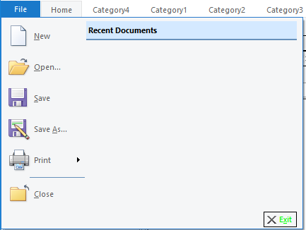
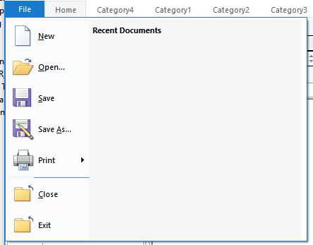
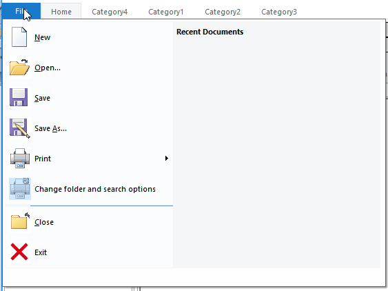
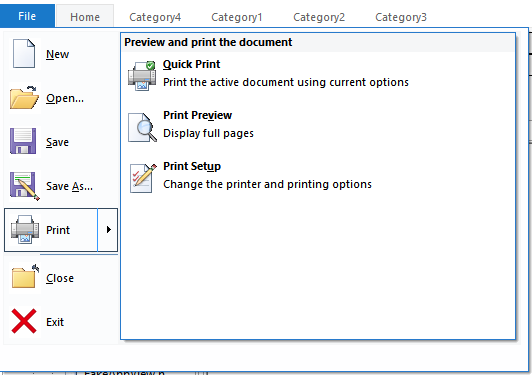
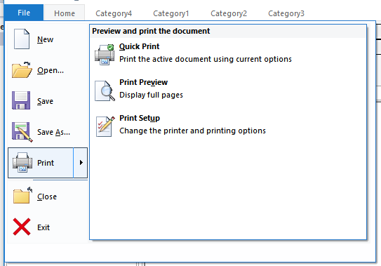
File Menu
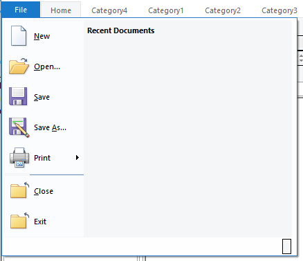
The next area where our example application greatly differs is in the menu that the “File” menu button (MainApplicationButton drops down)
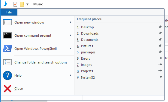
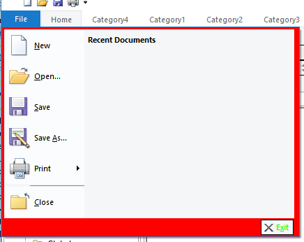
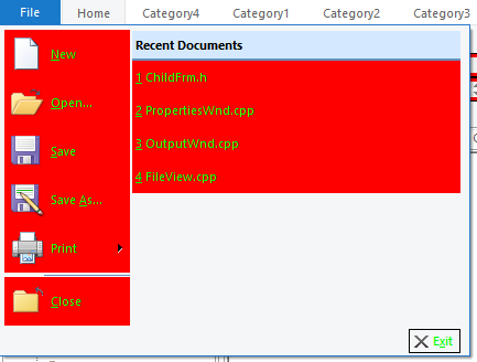
This is an area which we need to focus on because we have more blue here, which we obviously have not removed, the yellow exit is left over from an experiment where we were unsure of the usage of one of the colors
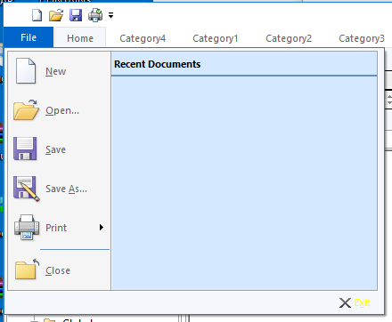
This is controlled by the OnFillRibbonMainPanelButton call, setting the color brightly we can determine which areas we are drawing
virtual COLORREF OnFillRibbonMainPanelButton(
CDC* pDC,
CMFCRibbonButton* pButton)
{
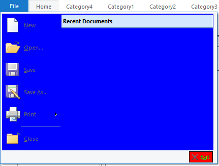
pDC->FillSolidRect(pButton->GetRect(), RGB(0xFF,0,0));
return RGB(0x00, 0xFF, 00);
}
By overriding more of the VisualManagers MainPanel calls
virtual void OnDrawRibbonMainPanelButtonBorder(
        CDC* pDC,
        CMFCRibbonButton* pButton
    )
    {
        pDC->SelectStockObject(BLACK_PEN);
        pDC->SelectStockObject(NULL_BRUSH);
        pDC->Rectangle(pButton->GetRect());
    }

    virtual void OnDrawRibbonMainPanelFrame(
        CDC* pDC,
        CMFCRibbonMainPanel* pPanel,
        CRect rect
    )
    {
        pDC->FillSolidRect(rect, RGB(0, 0, 0xFF));
    }
We can see how the other areas are drawn
For the Windows 10 this area is defined as two separate colors
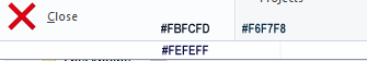
The right hand side is our m_clrWindows10Bar color so lets use this for now, the LHS is #FBFCFD
virtual void OnDrawRibbonMainPanelFrame(
        CDC* pDC,
        CMFCRibbonMainPanel* pPanel,
        CRect rect
    )
    {
        pDC->FillSolidRect(rect, m_clrWindows10Bar);
    }
Adding this gives us a single color
The frame part really does the border
virtual void OnFillRibbonMenuFrame(
        CDC* pDC,
        CMFCRibbonMainPanel* pPanel,
        CRect rect)
    {
        pDC->FillSolidRect(pPanel->GetRect(), RGB(0xFF, 0x00, 0x00));
    }
There is very little frame in the Windows 10 version (especially at the sides) and the color is
While its very subtle, the is a very faint color difference between the 3 sections
But to get a dual color for the left and RHS we’ll have to change a more fundamental call
virtual COLORREF OnFillRibbonButton(
        CDC* pDC,
        CMFCRibbonButton* pButton)
    {
        pDC->FillSolidRect(pButton->GetRect(), RGB(0xFF, 0, 0));
        return RGB(0x00, 0xFF, 0x00);
    }
This call is used to draw the buttons, but not just on the menu
We can override this call but it will effect everywhere
But it has almost the desired effect in the menu
However the ribbonbar buttons and tabs now look odd with a lighter background
We can control this, by only drawing the ligther color when the button is on the main panel
virtual COLORREF OnFillRibbonButton(
        CDC* pDC,
        CMFCRibbonButton* pButton)
    {
        if (pButton->GetParentPanel() &&
            pButton->GetParentPanel()->IsKindOf(RUNTIME_CLASS(CMFCRibbonMainPanel)))
        {
            // #FBFCFD
            pDC->FillSolidRect(pButton->GetRect(), RGB(0xFB, 0xFC, 0xFD));
            return GetSysColor(COLOR_WINDOWTEXT);
        }
        return GetSysColor(COLOR_WINDOWTEXT);
    }
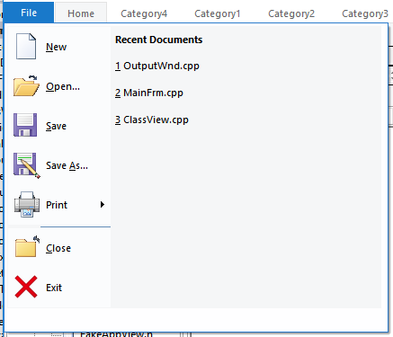
The blue “Recent Documents” Label was a little harder to determine, but ultimately this ends up being a MenuLabel which we hadn’t yet overridden via the OnDrawMenuLabel call
virtual COLORREF OnDrawMenuLabel(
        CDC* pDC,
        CRect rect)
    {
        pDC->FillSolidRect(rect, m_clrWindows10Bar);
        return GetSysColor(COLOR_WINDOWTEXT);
    }
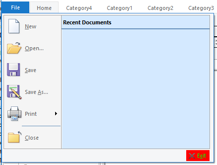
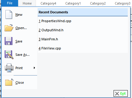
The result looks closer
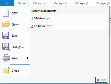
but Now the RHS buttons are incorrect, this can be prevented by altering the code a little, if we assume the RHS won’t have large icons then we can show the menu on the RHS in the barcolor and only the LHS has the lighter color (this assumption will come back to bite us later!)
virtual COLORREF OnFillRibbonButton(
        CDC* pDC,
        CMFCRibbonButton* pButton)
    {
        if (pButton->GetParentPanel() && pButton->GetParentPanel()->IsKindOf(RUNTIME_CLASS(CMFCRibbonMainPanel)))
        {
            // RHS of recent files does not have large icons
            if (pButton->IsLargeImage()) {
                pDC->FillSolidRect(pButton->GetRect(), RGB(0xFB, 0xFC, 0xFD));
                return GetSysColor(COLOR_WINDOWTEXT);
            }
        }
        return GetSysColor(COLOR_WINDOWTEXT);
    }
To be honest I’m still not happy with the way the menu looks
In relation to how it looks in windows 10, partially that is due to the icons which we can address but also its about the size of the LHS to the RHS and the background not drawing
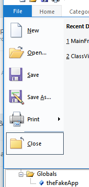
To get the menus to look more like Windows 10, we go back to the Ribbon designer in visual studio
You right click on the Buttons menu, and remove the Exit button from the bottom of the menu
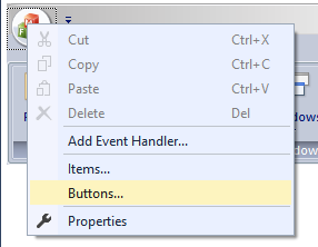
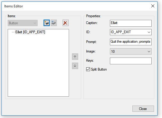
Then going back to the design right click the Items menu
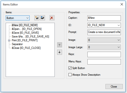
And add the exit menu there
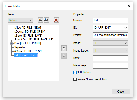
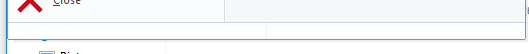
This moves the exit button (excuse the icon) onto the menu itself , however this removes the white border that was at the bottom of the Windows 10 menu
Then go back to the Buttons option and add an empty button.
Now we change our drawing code to remove the button drawing when the text is empty,
virtual void OnDrawRibbonMainPanelButtonBorder(
        CDC* pDC,
        CMFCRibbonButton* pButton
    )
    {
        CString text = pButton->GetText();
        if (!text.IsEmpty()) {
            pDC->SelectStockObject(BLACK_PEN);
            pDC->SelectStockObject(NULL_BRUSH);
            pDC->Rectangle(pButton->GetRect());
        }
    }
Using Paint.NET to make us a new “Exit icon”
The Windows 10 menu is also a little wider (520 pixels overall)
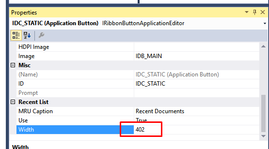
The demo only makes the ribbon panel 300, in the designer click on the Icon, and in the properties change the width to be ~400, The LHS is approximately 118 pixels wide, so the value of the Recent List needs to be ~520-118 to get the same size
ideally we’d make the LHS wider.
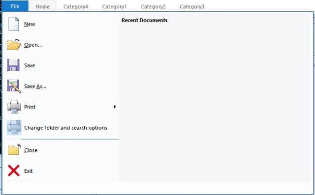
It was only later as I looked back at the MFC code I realized that the width of the LHS is dependent on the contents, if in our example the LHS contained the same longer description, “Change folder and search option” then the pane would be larger.
This means that really you need to be careful with your width setting, the 300 used by default is likely ample, giving our application the same Windows 10 sizing
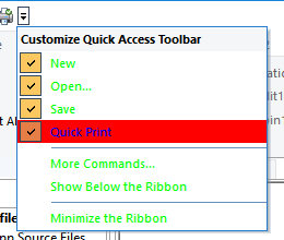
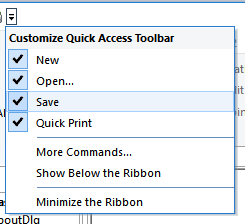
Menu Selection
The menu selection in Windows 10 is also a little different
This is also true for the QuickAccessToolBar
And this is not the case for our example application
Overriding GetMenuItemTextColor we can see how the menu gets its colors for the text
virtual COLORREF GetMenuItemTextColor(
        CMFCToolBarMenuButton* pButton,
        BOOL bHighlighted,
        BOOL bDisabled)
    {
        static_cast(pButton);
        static_cast(bHighlighted);
        static_cast(bDisabled);
        return RGB(0x00, 0xFF, 0x00);
    }
and overriding OnHighlightMenuItem we can see clearly that this controls the highlighted menu items
virtual void OnHighlightMenuItem(
        CDC* pDC,
        CMFCToolBarMenuButton* pButton,
        CRect rect,
        COLORREF& clrText) override
    {
        static_cast(pButton);

        pDC->FillSolidRect(rect, RGB(0xFF, 0, 0));
        clrText = RGB(0x00, 0x00, 0xFF);
    }
So for the Windows 10 look we make the following changes
virtual COLORREF GetMenuItemTextColor(
    CMFCToolBarMenuButton* pButton,
    BOOL bHighlighted,
    BOOL bDisabled) override
{
    static_cast(pButton);
    static_cast(bHighlighted);
    static_cast(bDisabled);
    return GetSysColor(COLOR_MENUTEXT);
}

virtual void OnHighlightMenuItem(
    CDC* pDC,
    CMFCToolBarMenuButton* pButton,
    CRect rect,
    COLORREF& clrText) override
{
    static_cast(pButton);

    // #EDF4FC
    pDC->FillSolidRect(rect, RGB(0xED, 0xF4, 0xFC));

    // #A8D2FD
    CPen pen(PS_SOLID, 1, RGB(0xA8, 0xD2, 0xFD));
    pDC->SelectObject(pen);
    pDC->SelectStockObject(NULL_BRUSH);
    pDC->Rectangle(rect);
    clrText = GetSysColor(COLOR_MENUTEXT);
}
And to handle the check box we have to copy a bit of logic from the base class, and also add to our project a 16×16 image of the check box tick (use Paint.NET to make this a transparent PNG)
class CWindows10Style : public CMFCVisualManagerOffice2007
{
    DECLARE_DYNCREATE(CWindows10Style);

    CMFCToolBarImages m_uiElements;
.....
In the constructor of the CWindows10Style class we load the bitmap
CWindows10Style::CWindows10Style()
{
    m_crlBkgn = RGB(0xFF, 30, 30);

    CMFCVisualManagerOffice2007::SetStyle(CMFCVisualManagerOffice2007::Office2007_Silver);

    m_tabFaceBrush.CreateSolidBrush(m_clrWindows10ApplicationButton);
    m_tabBlackBrush.CreateSolidBrush(GetSysColor(COLOR_WINDOWFRAME));

    // load the UI elements
    m_uiElements.Load(IDB_UI_ELEMENTS);
}
Then in the OnDrawMenuCheck we now utilize the colors and draw the check box
virtual void OnDrawMenuCheck(
        CDC* pDC,
        CMFCToolBarMenuButton* pButton,
        CRect rect,
        BOOL bHighlight,
        BOOL bIsRadio)
    {
        static_cast(pButton);
        static_cast(bHighlight);
        static_cast(bIsRadio);

        rect.InflateRect(0, 1);

        if (bHighlight)
        {
            // #C2DEFC
            pDC->SelectStockObject(NULL_PEN);
            pDC->FillSolidRect(rect, RGB(0xC2, 0xDE, 0xFC));

            // #5FA2E6
            CPen pen(PS_SOLID, 1, RGB(0x5F, 0xA2, 0xE6));
            pDC->SelectObject(pen);
            pDC->SelectStockObject(NULL_BRUSH);
            pDC->Rectangle(rect);
        }
        else {
            // #CEE5FC
            pDC->SelectStockObject(NULL_PEN);
            pDC->FillSolidRect(rect, RGB(0xCE, 0xE5, 0xFC));

            // #64A5E6
            CPen pen(PS_SOLID, 1, RGB(0x64, 0xA5, 0xE6));
            pDC->SelectObject(pen);
            pDC->SelectStockObject(NULL_BRUSH);
            pDC->Rectangle(rect);
        }

        CSize size(m_uiElements.GetImageSize());
        CRect imgRect(0, 0, size.cx, size.cy);

        if ((pButton->m_nStyle & TBBS_DISABLED) == TBBS_DISABLED)
        {
            imgRect.OffsetRect(0, size.cy);
        }

        m_uiElements.DrawEx(pDC, rect, 0,CMFCToolBarImages::ImageAlignHorzCenter,
            CMFCToolBarImages::ImageAlignVertCenter, imgRect);
    }
The result is a Windows 10 style Quick Access menu that looks closer to that of the Windows 10 file explorer

However the menu selection is done differently in the menu,
but by changing the OnFillRibbonButton call we can add the selection highlight
virtual COLORREF OnFillRibbonButton(
        CDC* pDC,
        CMFCRibbonButton* pButton)
    {
        if (pButton->GetParentPanel() && pButton->GetParentPanel()->IsKindOf(RUNTIME_CLASS(CMFCRibbonMainPanel)))
        {
            // RHS of recent files does not have large icons
            if (pButton->IsLargeImage()) {
                if (pButton->IsHighlighted()) {
                    // #EDF4FC
                    pDC->FillSolidRect(pButton->GetRect(), RGB(0xED, 0xF4, 0xFC));

                    // #A8D2FD
                    CPen pen(PS_SOLID, 1, RGB(0xA8, 0xD2, 0xFD));
                    pDC->SelectObject(pen);
                    pDC->SelectStockObject(NULL_BRUSH);
                    pDC->Rectangle(pButton->GetRect());
                }
                else {
                    pDC->FillSolidRect(pButton->GetRect(), RGB(0xFB, 0xFC, 0xFD));
                }
                return GetSysColor(COLOR_WINDOWTEXT);
            }
        }
        return GetSysColor(COLOR_WINDOWTEXT);
    }
Which in turn, highlights some minor differences in the submenu on the RHS
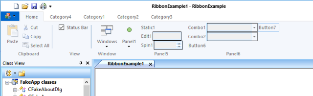
Tab Label
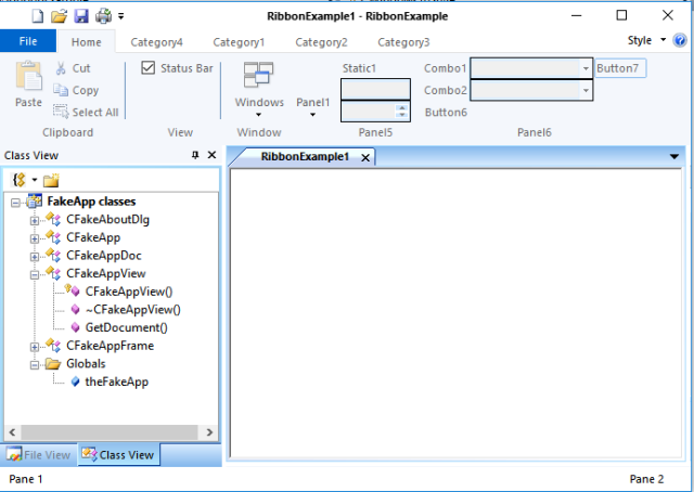
A minor bug in our earlier OnDrawTab function means we were using GetWindowText to get the tab label, this lead to some tab controls not drawing correctly
This was altered to use the GetTabLabel call
CString str;
pTabWnd->GetTabLabel(iTab, str);
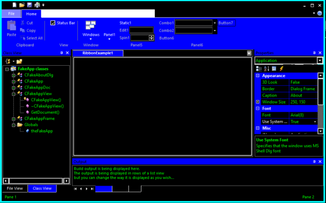
The examples used in these experiments are available online

 My Developer Day